Designing Biotomy, a biology study app
Making biology stick, for students who’ve stopped expecting it to.
Overview
Every resource we found was dense or expensive
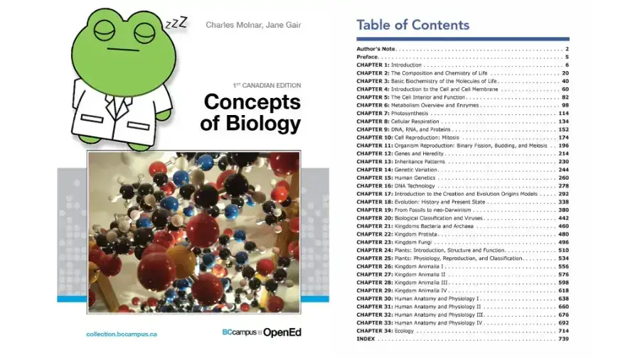
We started Biotomy by asking where students and teachers actually go to learn biology well. The answers were thick textbooks or expensive, text-heavy platforms that couldn’t hold anyone’s attention.
Most apps pick a side: simple enough for kids but missing the rigour, or the same dense textbook behind a login. We designed for the student in between, serious about the material but studying on a phone between classes.
A biology app built on one loop
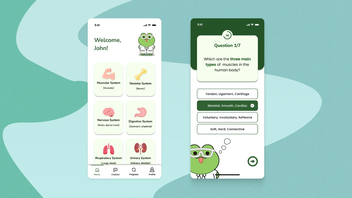
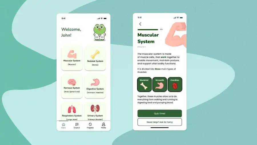
A mobile biology learning app built around a single loop, consume, test, track, repeat. Made for students studying in the gaps between classes, not in two-hour library sessions.
My role
I led the interaction design, as Product Designer and UX Researcher on a five-person team. I also contributed to persona development and system mapping across 40-plus screens.
Research
Cost was the top complaint in reviews
20 of 76
complained about cost or paywalls
15 of 76
said visual, interactive content helped
What helped
What they complained about
What I found
Cost was the most common complaint, at about a quarter of all entries, driven by paywalls on study features students had relied on. Among biology and anatomy reviewers, the strongest positive theme was visual, interactive content. Several said it explained what their textbook couldn’t. Streaks drew mixed reactions: more people described them as stressful than as motivating.
“The textbook is really hard to understand ... Khan Academy made it so much easier for me.”
What I did
After the project, I analyzed 76 public reviews and posts about Quizlet, Khan Academy, Complete Anatomy, Visible Body, Duolingo and Pearson’s Mastering platform. They came from App Store reviews, Reddit, student forums and student newspapers. I tagged each one by theme and counted how often each theme came up, separating out reviewers studying biology or anatomy.
What it changed
Looking back, this backed up the bet on visual lessons with quizzes inside them. It also showed price is a barrier on its own, which supports keeping the core loop free.
No option paired visual lessons with recall
What I found
Each option solved one part of the problem. Khan Academy is free but built around longer videos. Complete Anatomy is visual but priced and paced for medical students. Quizlet fits short sessions but puts its best practice modes behind a paywall, and textbooks keep the reading and the homework in separate places.
What I did
I compared the four resources that came up most in the reviews and forum posts. I looked at price, format, and two things Biotomy depends on: whether each one works in a short study session, and whether recall practice is built into the learning itself.
What it changed
No option paired visual lessons with built-in recall at a student price. That’s the gap the lesson card fills: visual first, with the quiz inside it.
Two learners the reviews kept describing
The review themes grouped around two kinds of student. They weren’t drawn from interviews, so I treat them as hypotheses to test, not findings.

Sarah, 23, university biology student
Studies in the fifteen-minute gaps between classes and pays for her own study tools.
Goals
- Finish a topic in one short session
- See that her study time is adding up
Frustrations
- Study features she relied on moved behind a paywall
- Premium resources are just as dense as the textbook

Ricardo, 16, high school biology student
Curious about how the body works, but loses focus on pages of text.
Goals
- See how a structure works, not just read about it
- Know right away whether he understood it
Frustrations
- Material that is dense, boring or hard to use
- Streaks that turn studying into pressure
“I am able to learn better by watching a video or by playing a game.”
Design
Principles, each tied to a finding
These check the team’s decisions against what students said. Each one names the finding behind it.
From research
Review mining: 15 of 76 said visual, interactive content helped, and 9 called their resources dense, boring or hard to use.
Visual before verbal
Lead with a diagram or model, and use text only for what the image can’t show.
From research
Review mining: 13 of 76 said practice, quizzes or feedback helped. Competitive analysis: textbooks keep the reading and the homework in separate places.
Practice in the flow
Quizzes, feedback and help sit on the same screen as the lesson, while the material is fresh.
From research
Competitive analysis: only Quizlet was built for short sessions. Khan Academy relies on 5 to 20 minute videos, and Complete Anatomy is a reference tool.
Fit the gap between classes
Anything a student starts should be finishable in one short session.
From research
Review mining: cost or paywalls was the most common complaint, at 20 of 76. Competitive analysis: no option paired visual lessons with recall at a student price.
Keep the core loop free
Lessons, quizzes and progress tracking never sit behind a paywall.
Every screen feeds the same study loop
Consume, test, track, repeat. Five features came out of journey mapping, not a feature wishlist:
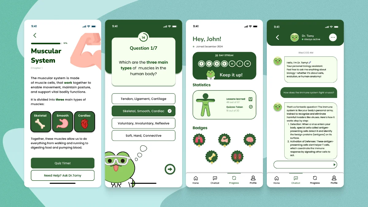
- Learning materials: interactive, visual anatomy lessons, not scanned textbook pages
- Quizzes: embedded directly into lessons, not behind a separate tab, so testing what you just learned doesn’t break your flow
- Progress tracking: completion percentage, quiz history, streaks, badges
- A gamified layer: streaks, leaderboards, rewards
- Dr. Tomy: an AI chatbot for on-demand biology questions, and for teachers, a way to generate supplemental material on the fly
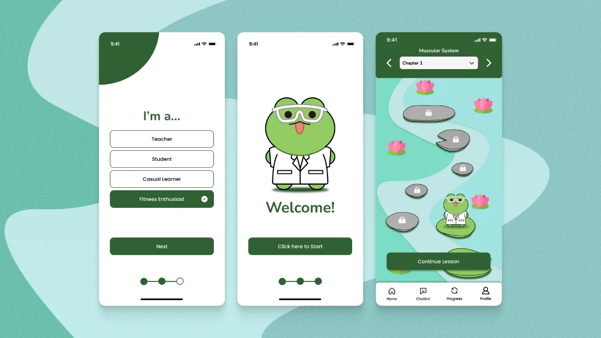
A signup question sets up each home screen
At signup, people pick a role and land on a home screen built for it, so nobody has to dismiss features that weren’t meant for them.
- Students see competitive leaderboards and streaks that make studying feel like something with momentum
- Teachers get classroom tools, quizzes, class-wide analytics, shared lesson plans, without a separate admin product
- Casual learners get a quieter version, the same content, none of the competitive pressure
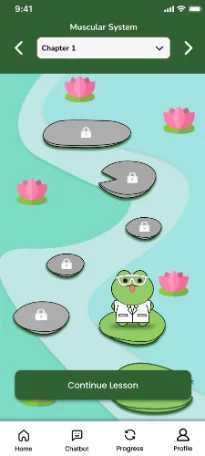
- Fitness enthusiasts land on the muscular system, with Chapter 1’s lessons laid out as a path to continue
With five people and 40-plus screens ahead, we documented colour, type and components before the first high-fidelity screen, building atoms and molecules first so every screen came from the same parts.
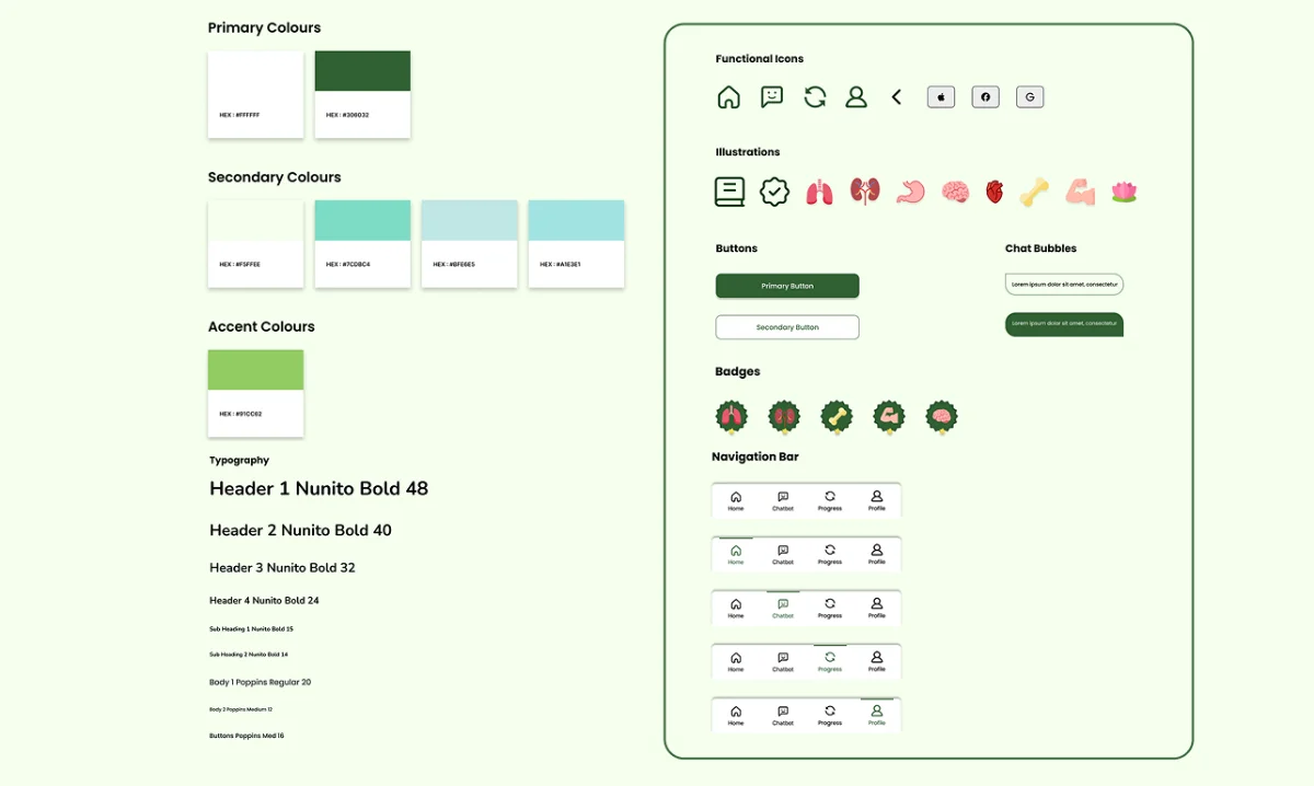
Design decisions and where they came from
Lessons open on the diagram
Lessons open on interactive, visual anatomy instead of scanned textbook pages, with text kept to what the visual can’t show.
From the principle Visual before verbal
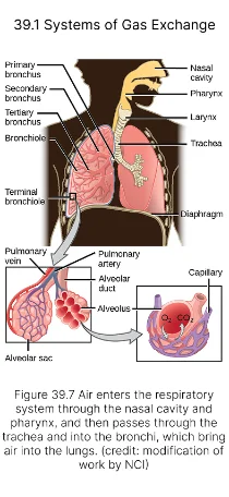
Typical resource
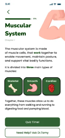
Biotomy
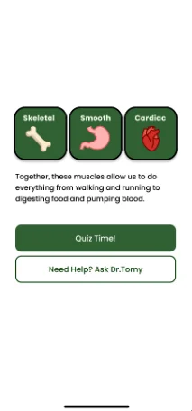
The quiz sits inside the lesson
Quizzes start the moment a lesson ends, with no separate tab to find, so testing what you just learned doesn’t break your flow.
From the principle Practice in the flow
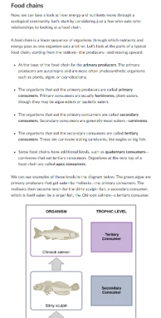
Typical pattern
Biotomy
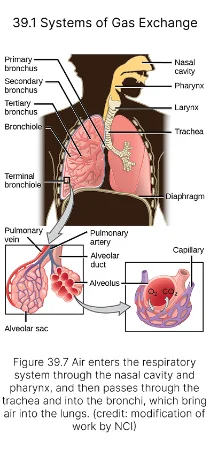
Each lesson fits between two classes
A lesson has to fit in the gap between classes, so each one ends before attention runs out, and each lesson is chunked into a few small ideas instead of a whole chapter.
From the principle Fit the gap between classes
Typical resource
Biotomy
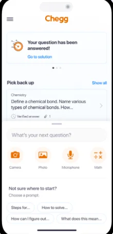
Navigation sits in a bottom bar
A hidden menu adds friction in the middle of a study session. A bottom bar puts the main destinations in the thumb zone as large targets (Fitts’s Law).
Typical pattern
Biotomy
The chatbot gets its own tab
A help button says “use this when something’s broken.” A tab says “this is part of how you study here.”
Dr. Tomy needed to feel like a learning companion, not a support widget.
Typical pattern (Deepstash, via Mobbin)
Biotomy
Green reads as nature, health and growth
Red is too aggressive, blue too clinical. Both carry the wrong emotional register for a subject students already find intimidating.
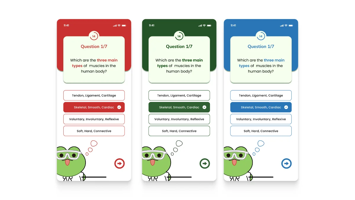
Too aggressive #C8312F
Biotomy #3A7D5C
Too clinical #2A76B8
Our first teal failed WCAG AA contrast
Contrast checks decided which greens and teals we could use at all.
Before
The first accent teal failed WCAG AA contrast testing against our background.
After
Adjusted to #A1E3E1 for a 4.5:1 ratio, with the visual identity intact.
Targets
These haven’t been tested yet
Three habit signals, chosen because the whole product depends on students coming back on their own.
Study sessions per week
3+
Short lessons built for the gaps between classes
Weekly active users
60%
The loop has to hold without reminders
30-day return rate
50%
The real test of whether the habit sticks
How I’d test it
A four-week pilot with one class, tracking these three numbers, plus a short survey on whether streaks felt motivating or stressful.
Reflection
Next time I’d test streaks before building them
The risk
Reviewers of other study apps described streaks as stressful more often than motivating. A reward that becomes the goal stops supporting learning and starts pushing behaviour.
What I’d change
Test the reward layer with real students before building it in, starting with a version where streaks are optional, the same way casual learners already get a quieter mode.