Overview
We picked a well-known brand with a weak app
We went looking for a well-known brand with little to no thoughtful UX behind its app, and since we all drink bubble tea, Chatime was an easy place to start. Their app’s rating told us everything before we opened it.
What made this project different from our others was time: months, not weeks. That meant we could actually validate what we built, survey real users, and go back and fix what didn’t work instead of shipping our first guess.
Chatime’s ordering and rewards app
Chatime’s bubble tea ordering and rewards app, with a 1.4-star rating. The brief was simple. The question was why.
People got lost in the app’s structure
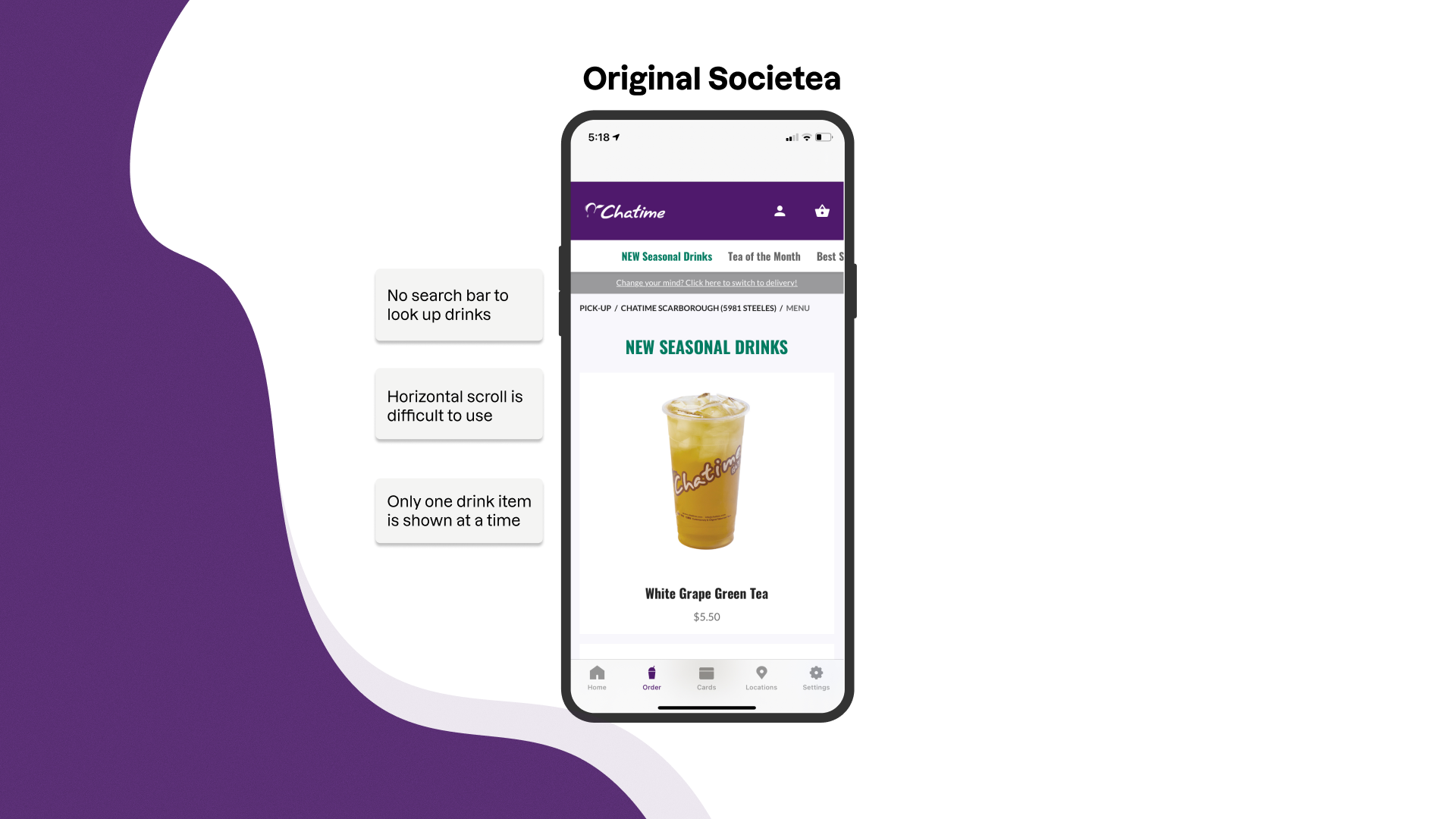
Drink tiles scrolled horizontally with no search function, so finding one specific drink meant swiping through dozens you didn’t want. Checkout spread across three separate pages with buttons that moved depending on where you were. Getting back to a previous step meant scrolling to the bottom of the screen to find a hidden nav link. The map view was cramped enough that picking a store felt like guesswork.
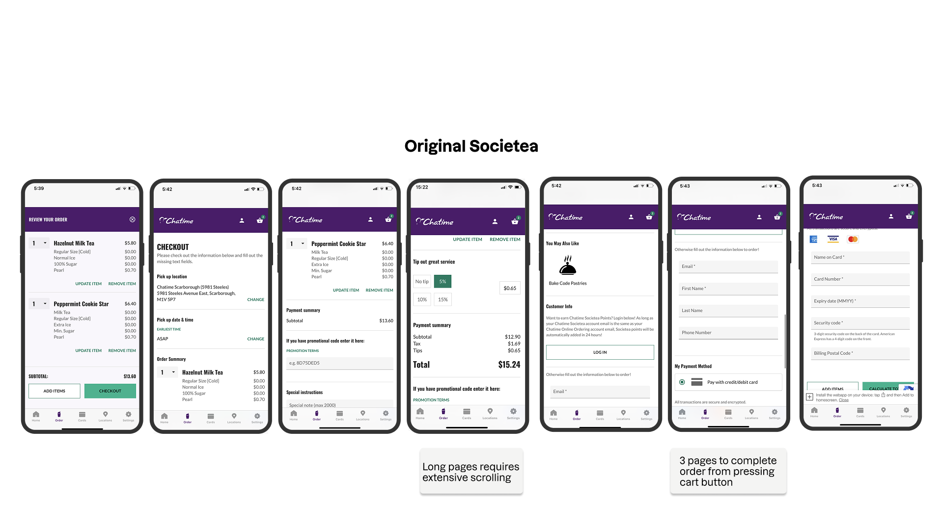
“The main problem is that I have to keep looking for the specific thing I want.”
None of these complaints were about how the app looked. They were about getting lost and giving up.
That’s an architecture problem, not a visual one, and it meant no amount of visual polish was going to fix what was actually broken.
My role
My first full information architecture project, from research artifacts through to validated hi-fi. I did the UX/UI design and user research on a team of five.
Research
41% ranked ease of use first
We ran competitive analysis against Starbucks, Tim Hortons, Uber Eats, and Balzac’s. We also ran surveys and interviews with regular bubble tea customers. Then we affinity-mapped everything we heard.
41%
of users ranked “ease of use” above every other priority.
That single stat moved the problem from “bad UI” to something closer to broken trust.

Kevin
A busy professional who orders the same drink most days and just wants to reorder fast.

Millie
Browses for variety and needs the menu to actually help her explore, not fight her.
We set three principles before touching a single screen: prioritize scannability, minimize how many taps anything takes, keep navigation patterns consistent from screen to screen.
And we held every screen to one test. If it didn’t directly serve a task from the research, it didn’t make the cut.
Design
Each change came from something users said
Search and browsing
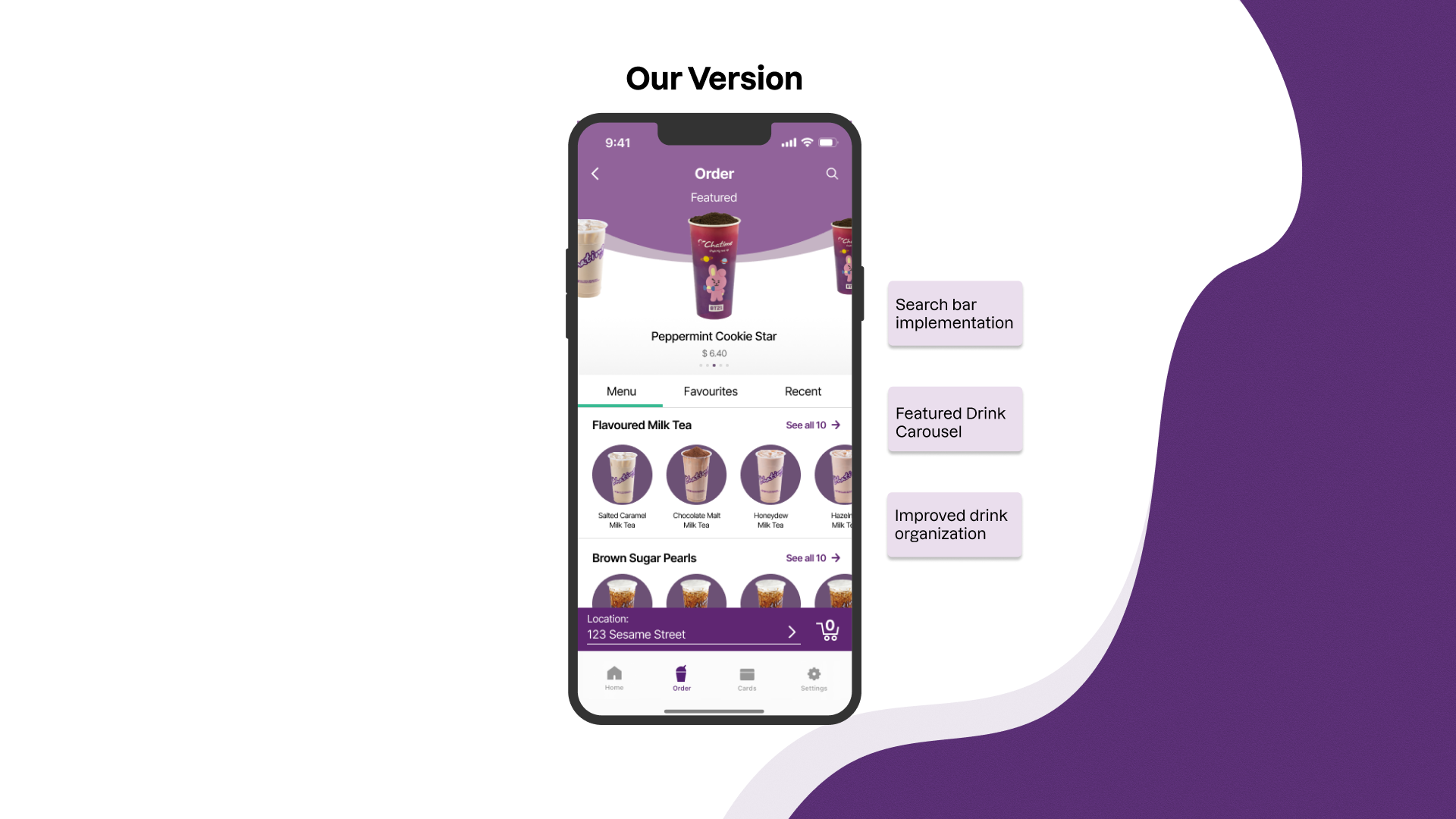
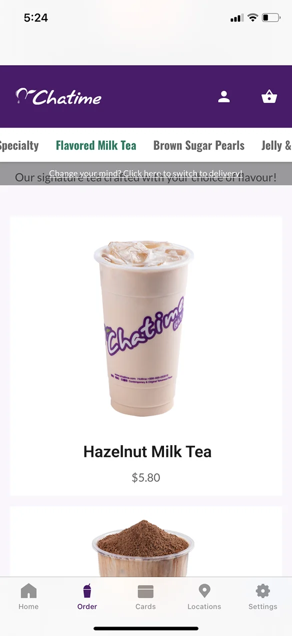
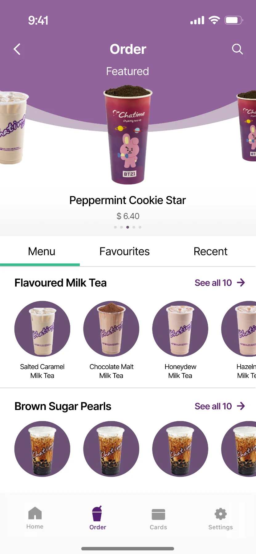
A persistent search bar, sort filters for New, Popular, Hot, and Cold, and a layout change from horizontal scroll to a 2-column vertical grid. The New, Popular, Hot and Cold filters cut the menu down before anyone has to choose, so there are fewer options to weigh at once (Hick’s Law).
2 → 6
drinks visible per scroll
Favourites and Recent
Dedicated tabs built specifically for someone like Kevin.
8 → 3
taps to reorder
Before
After
Customization
We collapsed radio buttons into sliders and consolidated required and optional choices onto a single screen instead of splitting them across steps. We also added a floating “Add to Cart” button and got rid of the hidden back-navigation that had users scrolling to find their way out.
Before
After
Maps and locations
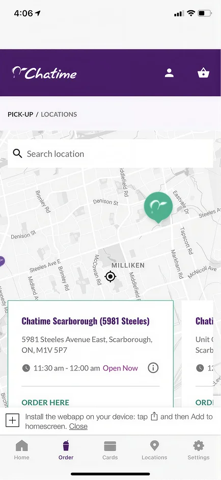
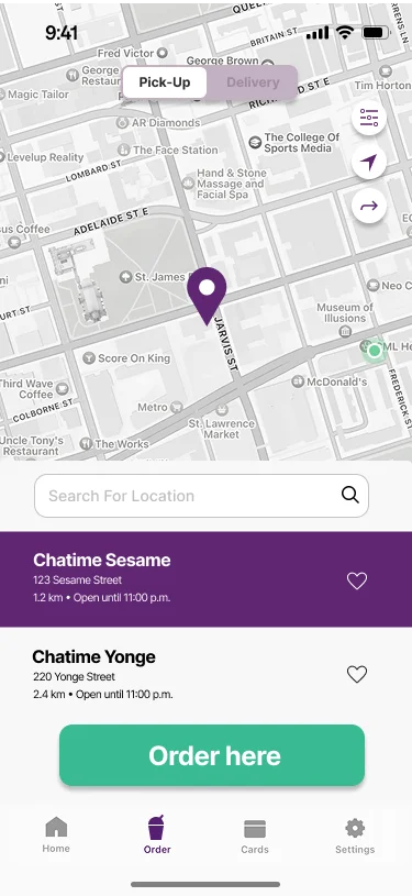
Location cards were pulled out from under the map overlay where they’d been buried. A prominent “Order Here” button with a delivery/pickup toggle now sits at the top level, not several taps deep.
40%
larger map viewing area
Checkout
We merged review and payment into a single step, added real-time price updates as you customize, and built in order status tracking after confirmation.
3 → 2
checkout pages
Before
After
A smaller site map and a shorter flow
36 → 20
items in the site map
28 → 25
steps in the core user flow
Before
After
Before
After
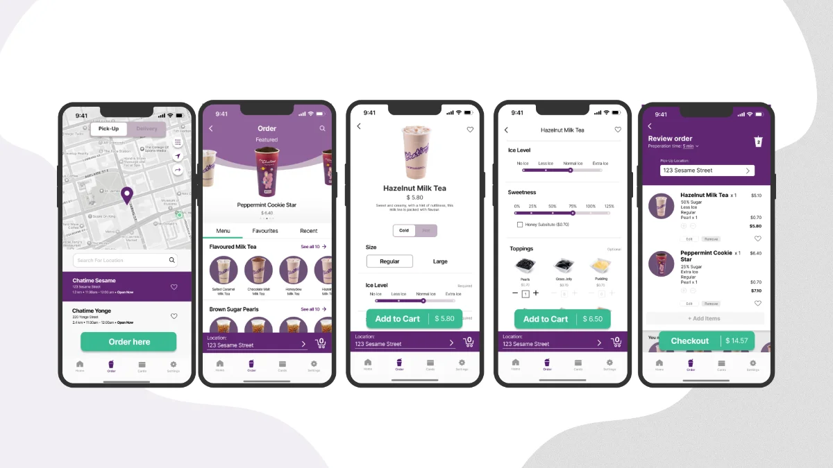
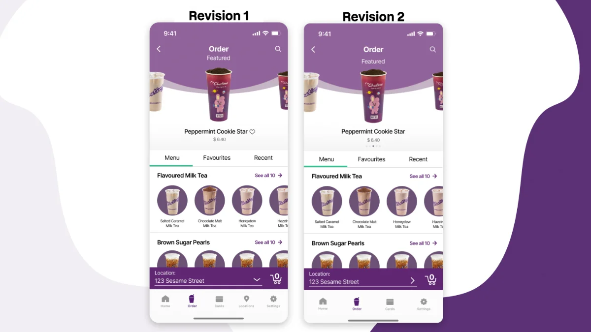
Outside critique caught a false dropdown
The location banner had an arrow that read as a dropdown. It wasn’t one. Nobody on the team caught it, because we’d stared at that screen too long to see it fresh.
Drink cards were missing visible pricing. The customization screen didn’t separate what was required from what was optional. People were getting stuck on fields they didn’t actually need to fill in.
Results
The same users finished tasks faster
They used the redesign, and they were the ones who confirmed the fix.
Measured with users, not projected
40%
faster task completion
Significantly higher self-reported confidence navigating the app, from the exact users who had flagged the original problems.
The people who told us it was broken confirmed it felt fixed.
Reflection
Next time I’d test lo-fi wireframes first
What we’d change
If I did this again, I’d run guerrilla usability testing on lo-fi wireframes before ever going hi-fi.
What it would have caught
That false dropdown affordance could have been caught in a five-minute paper prototype test, weeks before it ever showed up in a polished screen.
This was my first full information architecture project, working in a team of five, all the way from research artifacts through to validated hi-fi. The lesson that stuck: a redesign only means something once the people who complained the loudest come back and say it’s different now.