Brand and website copy for Zentra
Finding the words an AI financial platform for founders uses to explain itself, then building the brand, website, and design language around them.
Overview
An AI CFO for founders
An AI financial platform that turns a founder’s raw numbers into plain language insight on runway, burn rate, MRR, and cash flow. It acts as an AI CFO before a founder can afford a real one.
The product worked, but it had no brand
When Miydesign brought me onto Zentra, there wasn’t a brand yet. We had a handful of references and a product that hadn’t figured out how to describe itself.
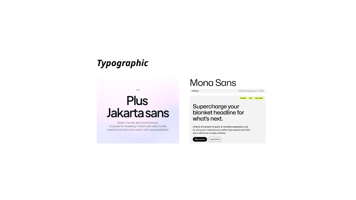
The first job was the words: a voice that could make a fintech company sound less like a spreadsheet and more like a CFO in your pocket. The colours, type, and layout followed from that voice.
The problems the site had to solve
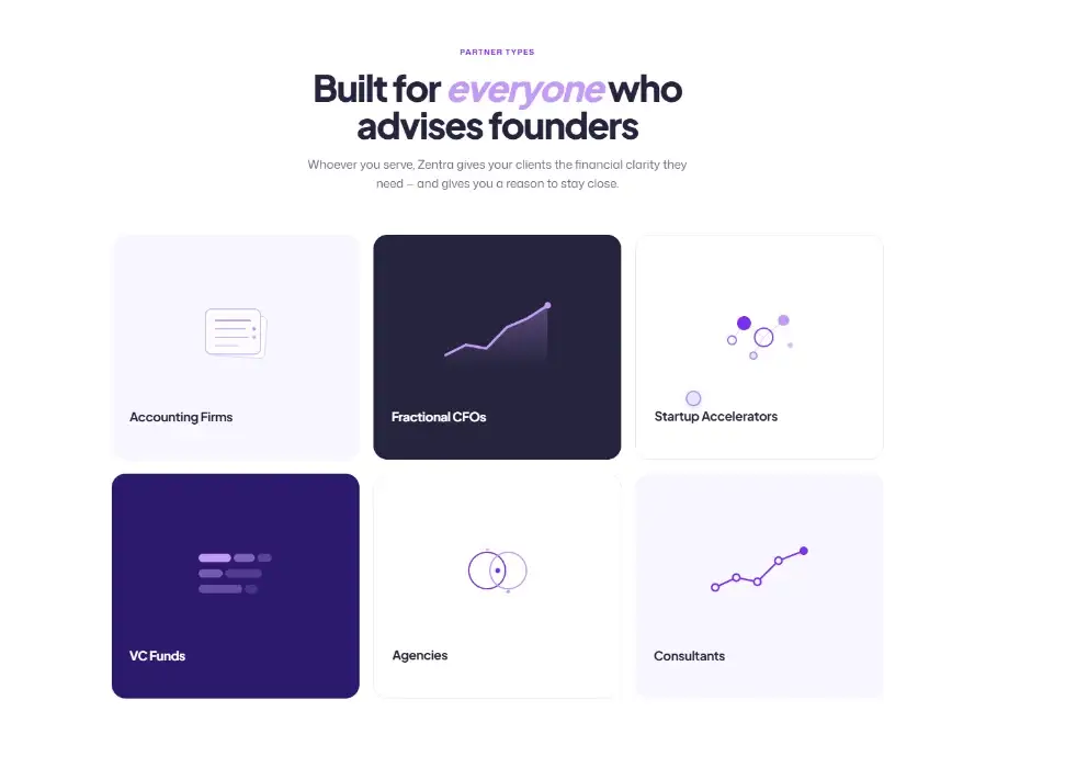
Founders and partners shared one site
Founders came for speed and clarity. Partners came for incentive and credibility. Both had to be spoken to without splitting the site in two.
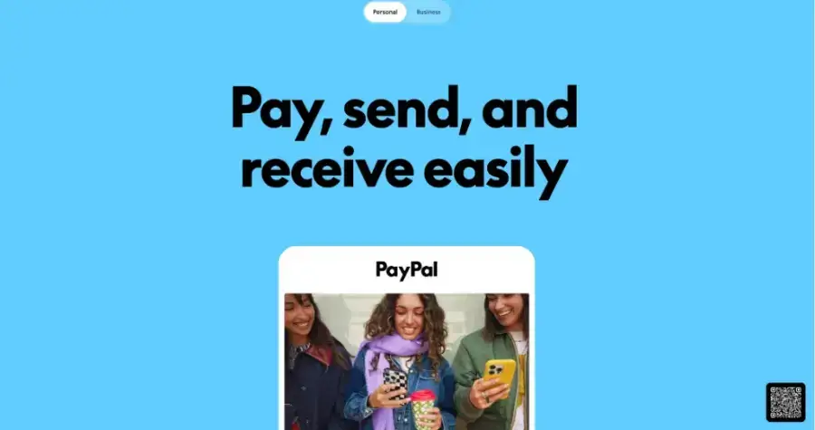
Finance sites all sound the same
Cold, corporate, written for accountants. Zentra had to sound built for founders without losing the seriousness of the numbers underneath.
Each new page started from scratch
No type scale, no colour tokens, no components, so every page drifted from the last.
My role
I designed six production pages and an early dashboard concept as part of the Miydesign team. The work ran from brand workshop through mobile implementation.
Research
I wrote the messaging before designing anything
I compared other brands’ homepage copy
What I found
The finance brands earn trust with proof: customer counts, uptime, processed volume. Linear earns it with restraint, short declarative lines and almost no adjectives.
None of them lead with the question a founder actually types, like “how long until I run out of cash?”. That left room for Zentra to open with the question itself.
What I did
I read the homepages and pricing pages of Ramp, Mercury, Linear, and Stripe and logged every headline, subhead, and CTA in one sheet. For each, I noted sentence length, how jargon was handled, and what proof backed each claim. Linear was a deliberate outlier: not a finance product, but the clearest benchmark for short, confident product copy.
What it changed
Zentra’s hero became a question instead of a claim, “Ask your finances anything.” Proof moved further down the page, and every number had to pass the accuracy checklist before it shipped.
Design
Four rules for how Zentra writes
Answer first
Lead with the number or the decision, then explain.
- This
- “You have 14 months of runway at your current burn.”
- Not that
- “Zentra leverages AI-powered analytics to deliver comprehensive runway insights.”
Use the words founders use
Write the question a founder would type, not the term an accountant would file it under.
- This
- “When will I run out of cash?”
- Not that
- “View your cash depletion forecast and liquidity projections.”
Keep the tone calm
Confidence comes from specifics. No exclamation marks, no “revolutionary.”
- This
- “Read-only, always. Zentra can’t move money or change your books.”
- Not that
- “Bank-grade, military-level security you can trust 100%!”
Only say what’s true
If we can’t verify it, we don’t publish it. If Zentra doesn’t know, it says so.
- This
- “If it can’t find the number, it says so instead of guessing.”
- Not that
- “Trusted by 10,000+ founders worldwide.”
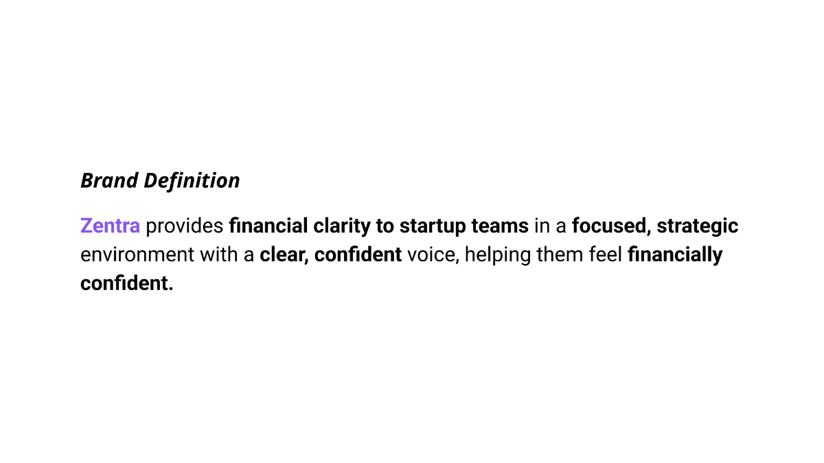
Everything started from one positioning line
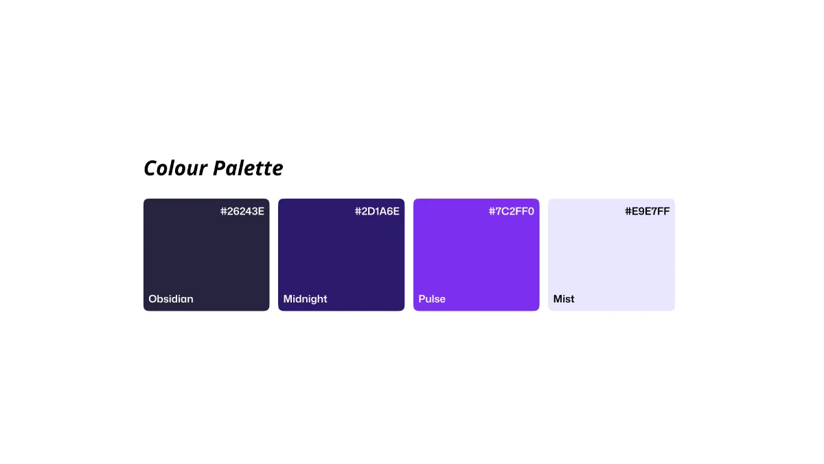
The brand sentence came first, and every visual choice answered to it. We tested four palette directions against it until one felt founder-facing without feeling unserious.
Why these colours
The founders came in with one firm request: purple. They wanted Zentra to feel trustworthy, and to them purple carried that. Most colour research ties trust to blue, so the job was finding a purple with blue’s steadiness that didn’t look like every bank’s navy.
Each brand in this space signals trust its own way: Stripe’s electric blurple, Mercury’s dark navy with a quiet indigo accent, Ramp’s single loud yellow. Stripe proved purple can work in finance, which made it the brand Zentra most needed to avoid resembling. Stripe uses blurple as an accent on links and buttons. Zentra uses a deeper violet as a full brand surface, in the hero and logo field.
Every text pairing below passes WCAG AA.
Colours taken from the live site. WCAG AA needs 4.5:1 for body text, AAA needs 7:1.
In context
Approximate brand colours, sampled from each live site.
Each line answers one founder question
Hero headline
“Ask your finances anything.”
- Its job
- Explain what Zentra does by inviting the visitor to use it.
- Why
- A question invites someone to try it. A claim only asks them to believe it.
Subhead
“Freelancer, agency, consultant, small team — whoever you are, Zentra turns your numbers into plain-English answers. Just ask.”
- Its job
- Answer “is this for me?”
- Why
- It names the people who’d use it in their own words, and promises answers instead of dashboards.
Call to action
“Join waitlist”Free during beta · No credit card required
- Its job
- Remove the cost question at the moment of decision.
- Why
- “Free during beta” answers cost and sets the expectation that it’s early. The line under the button covers the card question.
Pricing descriptions
- Launch
- “Idea stage and MVP teams getting their first clear view of the numbers.”
- Growth
- “Startups in growth stage that need deeper planning and larger teams.”
- Its job
- Let someone pick a plan by their stage, not by counting features.
- Why
- Each description says who the plan is for, so there are only three stages to choose between instead of a feature grid to compare (Hick’s Law). The feature list underneath handles what’s in it.
The same voice across all six pages
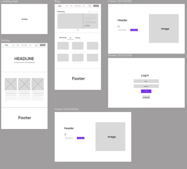
Home, Pricing, Partner, Blog, Join Waitlist, and Log In. Each page has one job and a headline that states it, all drawn from a shared voice and component library.
Tabs fixed the broken mobile sections
A scroll-jacked platform section and a clipped pricing table both became tab patterns.
Platform section
On mobile, the scroll-jacked section became tabs, so every card is one tap away instead of hidden behind a long scroll.
Pricing
The three plans sit side by side on desktop, and under 768px they stack into one column while the comparison table becomes tabs, one plan at a time.
Targets
I checked the shipped copy against research
The hero was missing specifics
10 seconds
The window a page has to communicate its value before most visitors leave (Nielsen Norman Group)
3/4
Questions the shipped hero answered above the fold
What I found
Nielsen Norman Group’s page-visit research puts the stay-or-leave decision in the first 10 seconds. The shipped hero answered what Zentra is, who it’s for, and what to do next without a scroll. It never named the metrics it covers, so a visitor had to keep reading to learn it tracks cash and runway.
What I did
Without founders available for a live test, I checked the hero against published research instead. Then I audited the version I shipped in August against the questions a five-second test asks: what is it, who is it for, what does it cover, and what do I do next.
What I’d change
The question-led headline and the named audience held up. The gap was specifics.
Since handoff, the live subhead names runway, burn, and MRR, the same fix this audit points to.
“Join waitlist” said exactly what would happen
[6/8]
Users in a Nielsen Norman Group study who clicked a generic “Get Started” expecting information and landed in a signup flow instead
What I found
Nielsen Norman Group found that generic labels like “Get Started” set the wrong expectation: most users who clicked one expected information and landed in a signup flow. I scored the common alternatives against their guidance (specific, sincere, substantial, succinct). “Join waitlist” passed on the two that matter most for a beta, saying exactly what happens and being honest about access.
The pages and components that shipped
6
production pages shipped
24
components documented
8
weeks from brand workshop to handoff
The bar for the next version: 8 in 10 visitors can say what Zentra does, and what the button does, after a five-second look.
Reflection
Writing took most of the design time
Working live
Direct work with a founder and a small studio team on a sprint schedule, with decisions made in days rather than weeks.
Integrity
Catching fabricated claims taught me that accuracy is a process running through the whole project, not a final review.
What I’d do differently
Test the hero copy with real visitors before handoff, not after. The gap my audit found, no named metrics, is something a five-second test would have caught in May.
The site has continued to evolve since handoff in August 2026.